( ! ) Deprecated: strip_tags(): Passing null to parameter #1 ($string) of type string is deprecated in /home/jlahijani/Sites/goodui.org/site/templates/_og.php on line 13
Bomgar.com, a leading remote access and support platform, recently ran a multiple change A/B test on one of their landing pages. Here are the changes which were tested with a nice positive outcome - some of which were inspired by our evidence-based patterns.
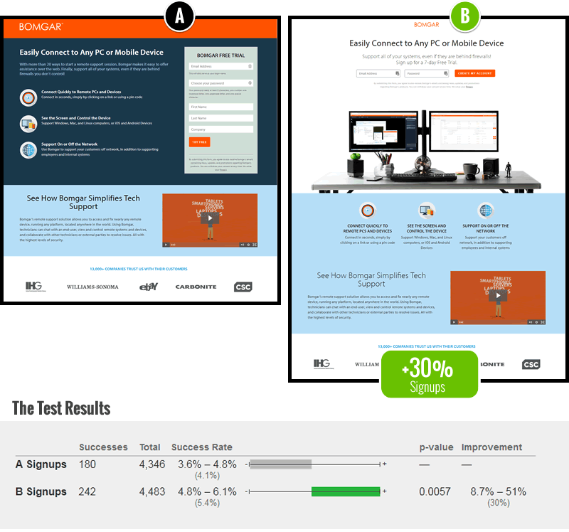
The A/B test results showing a 30% increase to signups (measured by next page visits)
The 6 Changes
Here are the 6 things that were changed (interpreted by me).
The B variation with the 6 changes
More Subtle Branding
The first thing you might notice comparing A and B, is that the variant de-emphasized the logo. The Bomgar logo has been shrunk in size, and lost its strong contrast orange background strip.
Centered Forms - Fastforward Pattern #13
The input forms have been centered, gaining in additional attention. This is a powerful layout change which we have observed to perform numerously in past experiments.
Fewer Form Fields - Fastforward Pattern #3
Some of the form fields such as first name, last name and company were removed - a classic friction removal pattern.
Button Label Change
Instead of "Try Free", the button was changed to "Create My Account". Could "account creation" hold more value from a feeling of ownership than a trial?
Clarifying Image
An image was added showing two dekstop computers - possibly reinforcing the idea of access between one computer and another.
Shifted Descriptions
Finally, the 3 benefit descriptions were pushed further down on the page (as the form was centered).
Share Your Thoughts
Are there any other key reasons why you think the B variation outperformed the control? Please share your thoughts as a comment.
I like this test very much, thanks for sharing. But I have a little trouble with testing 6 actors in conversion optimization at the same time. Because it's not clear what's the effect of every individual actor is. For instance what happens if we eliminate 2 of the 6 actors?
Hi David, here is a more recent answer & poll on the same question: https://goodui.org/blog/is-it-correct-to-make-multiple-design-changes-in-a-single-test-variation/
Did they test a fewer form fields as a variant on their old landing page? I'd love to know what all the other elements did for conversion vs that big change.


Comments
David Efdé 7 years ago ↑0↓0
I like this test very much, thanks for sharing. But I have a little trouble with testing 6 actors in conversion optimization at the same time. Because it's not clear what's the effect of every individual actor is. For instance what happens if we eliminate 2 of the 6 actors?
Reply
Jakub Linowski 7 years ago ↑0↓0
Hi David, here is a more recent answer & poll on the same question: https://goodui.org/blog/is-it-correct-to-make-multiple-design-changes-in-a-single-test-variation/
Reply
Jonathan 8 years ago ↑0↓0
Great A/B test. Really shows how a good A/B test can produce some good data for change.
Reply
Nitesh S 8 years ago ↑1↓0
Thanks for posting this Jakub!
Did they test a fewer form fields as a variant on their old landing page? I'd love to know what all the other elements did for conversion vs that big change.
Reply
Ivan Burmistrov 8 years ago ↑0↓0
Very strange... IMHO the only factor that might improve conversion is (3) Fewer Form Fields...
Reply
Ivan 8 years ago ↑2↓0
I suppose white background and image are the biggest drivers of the conversion change.
Reply
Kevin 8 years ago ↑0↓0
Thank you for sharing, it is really inspiring and serves as arguments in order to offer much needed services to some clients.
Reply